Portable Taste
Craft
I shipped four things this past week at Daydream: an end-to-end visual prototype of where the product is going, a functional MVP for a board meeting, a complete design system with tokens and components, and a working iOS app. All of them are live. I built every one of them by myself, in seven days, with Claude doing the typing.
None of this was possible a year ago. A team of four on a six-week sprint, maybe, and even then the output would have been a deck and a Figma file, not a thing you could run. The shift isn’t that designers make more stuff. It’s that the stuff designers make changes shape. What used to live as comps and presentations now lives as code you can touch.
This is a case study of that shift in practice.
The vision prototype
The company had strong conviction about where the product needed to go. The hard part was getting the rest of the team to feel it. Decks explain, but they don’t convince, and the gap between “we agree on paper” and “we agree on the thing” is where strategy dies.
So I built the vision as a running product. End-to-end. Not a series of clickable screens, an actual walkthrough of the experience a customer would have from entry to engagement to loyalty, designed in the new visual language, running in a real browser on a real URL. If you’ve ever used the thing we’re trying to build, you know what it should feel like. Now the team does too.
The unlock here is emotional. You can argue with a deck. You can’t argue with the experience of scrolling through your own personalized product and having it feel right. That’s the moment strategy stops being a meeting and starts being a direction.
The MVP
While the vision shows where we’re going, the MVP shows what we’re shipping. It’s the Whitney journey: five steps from an unpersonalized homepage through, a 14-turn chat, into a filled-out Passport, back out to a smarter homepage, and finally into a re-engagement feed a week later. Every screen demonstrates a different signal the product is capturing. Every interaction ends with a toast that tells you exactly what just happened: Signal updated. Added “coastal minimal” to your palette.
The MVP has its own infrastructure underneath: a shared toast provider, a reusable feedback card library (six units mapped to the product PRD), a journey orchestrator, a sticky progress bar. The feedback units share a single frame, so any new card type drops into the system with built-in submit states and success feedback. I designed this to scale, our PMs can describe a new signal to collect and the visual structure is already there.
The MVP is scoped tight. Five steps. No moonshots. Every pixel of it demonstrates something in the current PRD, which is why it works for the board: aspirational in feel, honest in scope.
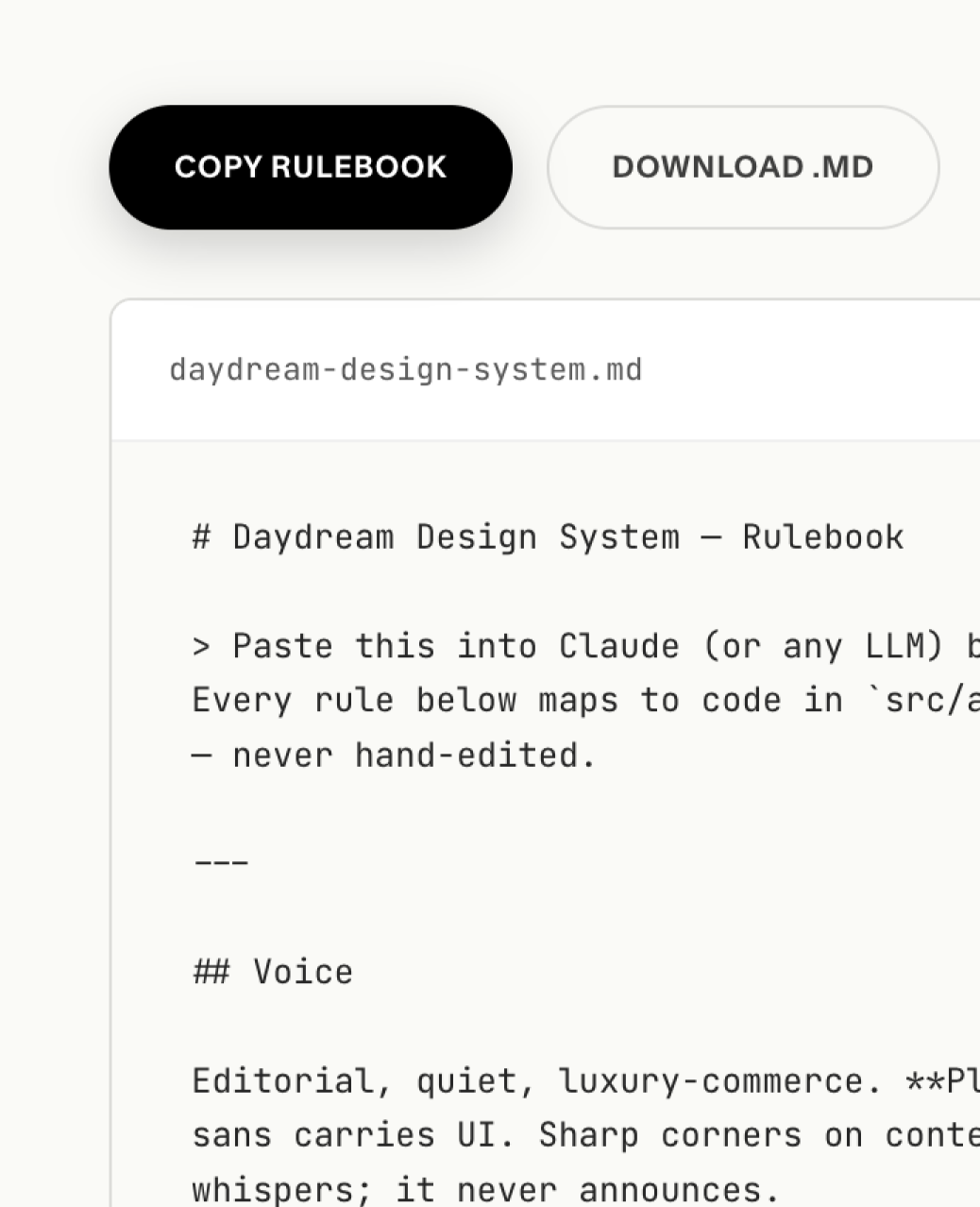
The design system
None of the above exists without the system underneath it. I rebuilt our entire visual language this week — tokens, components, typography, motion. A warm editorial palette. Two licensed typefaces (a serif for editorial moments, a workhorse sans). A component library built on shadcn but retuned for our voice. Opacity-based layered borders for a hairline editorial feel. Theme tokens that adapt light-to-dark cleanly without breaking contrast.
The components aren’t decorative. They’re load-bearing. The vision prototype and the MVP and the iOS app all render through the same tokens and primitives. When I change the border radius or the body line-height in one place, it propagates everywhere. The system is what makes the speed possible. You can’t ship four prototypes in a week if each one is rebuilding its primitives from scratch.
What’s new here isn’t the component library. Every company has a component library. What’s new is that I built the system and immediately used it to ship four different things — which is the only actual test of whether a design system works.
The iOS app
To stress-test whether the new visual system would survive on mobile, I built a web prototype that poses as a native iOS app. Functional enough to navigate, typed against our current strategic thinking, built on the same tokens and components as everything else. You load it on your phone and it feels like a real app.
The reason I built this before we wrote a line of real iOS code: engineering time is the most expensive input at a company our size. Every motion detail, every navigation decision, every typographic choice that survives this prototype saves us from finding it out after we’ve paid for it. Bugs in the design become bugs on a URL, not tickets in a sprint.
This is where a colleague’s stress-testing of the navigation comes in, his work went straight into the prototype and now has a real interactive context to live in. Collaboration at this speed looks different than it used to. Instead of handing specs across a table, we’re handing live URLs across Slack.
What made this possible
None of this is about AI being fast. It’s about what happens to a senior designer’s role when the cost of producing a working artifact collapses. For fifteen years I’ve been the person who sits in reviews, redlines mocks, and describes a vibe. My job was to hold the bar high by being in the room.
The bar is still mine. The decisions are still mine. Every type choice, every spacing call, every motion curve: my hand. What changed is that I don’t have to draw each of those decisions into a Figma file by hand while the rest of the company waits. I can describe the decision and have the code in thirty seconds. Which means my time, the limiting factor in the whole system, goes into the decisions, not the production.
This is what AI-native design practice looks like when it’s load-bearing rather than performative. It isn’t prompt-to-comp. It’s a designer who knows exactly what they want, working with a tool that can produce it at the speed of thought.
The thesis
Taste used to live in the person. If you wanted your team to design with your direction, you sat in every review and ran a standing critique and wrote Slack threads trying to describe a vibe. You were the filter. Taste was illegible unless you were in the room to explain it.
Now taste can live in a file. A running prototype. A tokenized system. A working URL that the whole team can open on their phone and feel. The director doesn’t have to be in the room because the direction is in the artifact. Critique shifts from “tell me what you were thinking” to “show me where this breaks.” The team aligns the first time they open the thing, not the fourth time you explain it.
This is what senior design leadership looks like at the AI inflection point. You don’t lead by editing, you lead by shipping the thing people align against. You don’t protect the bar, you put it in people’s hands. Same taste, different medium. Same craft, different ceiling.
The designers who figure this out are going to run circles around the ones who are still writing vision decks.